Exploratory Data Analysis
This project deals with civic data analyses of SAT scores by state & drug use by age; looking for useful patterns and possible hypotheses. EDA is an essential part of the data science analysis pipeline. Few of the EDA good practises will be described in this post.
- Read a csv file
- Data Dictionary
- Plotting
- Importance of standardization
- Correlation and Covariance
- Dealing with outliers
- Summary
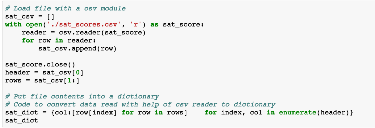
Read a csv file


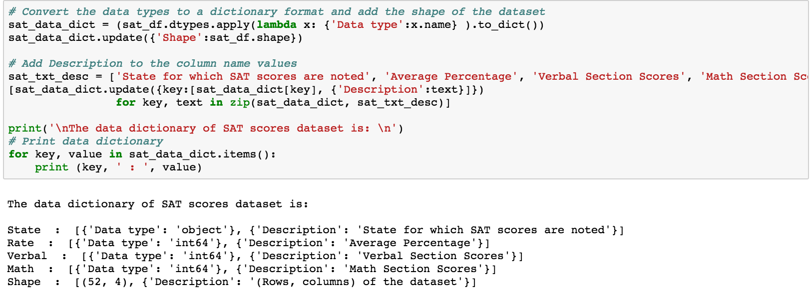
Data Dictionary
A data dictionary is an object that describes your data. This should contain the name of each variable (column), the type of the variable, your description of what the variable is, and the shape (rows and columns) of the entire dataset. It is a good practise to create a data dictionary as it provides a concise guide to understanding the data.

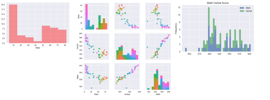
Plotting
- Dist plot is useful to plot univariate distributions of features.
- The pair plot plot is a good visualization tool to view all numeric values against each other on either axis. This along with the hueis helpful in identifying any pattern relating to the hue.
- Stacked histograms provide a visual comparison of the variable distributions.

Importance of standardization
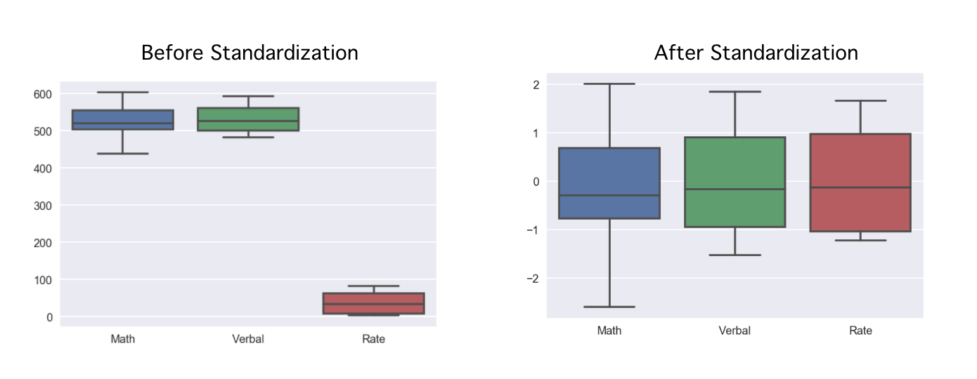
- What are the benefits of using a boxplot as compared to a scatterplot or a histogram?
- Better visualization of the score range and the quartile values. With histogram or scatter plot, it is not possible to read the descriptive statistical values in a glance. Range(Math) > Range(Verbal). Median(Verbal) > Median (Range)
- Box plot is good to compare statistical parameters when plotted on the same chart. It would make sense if they are all scaled proportionately. Hence, the variables need to be rescaled using a procedure called “standardization”, which forces the distribution of each variable to have a mean of 0 and a standard deviation of 1.¶ standardized_variable = (variable - mean_of_variable) / std_dev_of_variable

Correlation and Covariance
- Describe how the covariance matrix is different from the correlation matrix.
- Correlation is measured in the range -1 to 1 and is easier to interpret. Covariance values are dependant on thevariance and unit of the values and is not a good measure to compare relations as they are not normalized.
- What is the process to convert the covariance into the correlation
- Cor(X,Y) = Cov(X, Y) / Std(X) Std(Y)
- Why is the correlation matrix preferred to the covariance matrix for examining relationships in your data?
- “Covariance is the measure of relatedness between variables. Covariance is not very interpretable. The values are difficult to read because they are relative to the variance of the variables. A much more common metric, and one directly calculable from the covariance, is the correlation.”
- How does the spearman correlation compare to the pearson correlation?
- The Spearman rank correlation of Verbal and Math values is equal to the Pearsons correlation of the Rank of Verbal and Math values.(Inferred from the below steps)
- Describe clearly in words the process of calculating the spearman rank correlation.
Hint: the word “rank” is in the name of the process for a reason!
- Get the rank list of the series that are to be compared.
- Find the covariance between the rank data.
- Calculate individual standard deviations.
- Divide Covariance by the product of standard deviations.
- This is the spearman rank correlation.
Dealing with outliers
Outliers are an interesting problem in statistics, in that there is not an agreed upon best way to define them.
- How can you numerically define outliers?**
Mathematically, Tukey method can be used to find outliers. Numerical description of outlier(Mathematical formulae):
- Low outliers = Q1 – 1.5(Q3 – Q1) = Q1 – 1.5(IQR)
- High outliers = Q3 + 1.5(Q3 – Q1) = Q3 + 1.5(IQR)
- Where:
- Q1 = first quartile
- Q3 = third quartile
- IQR = Interquartile range
Summary
The following techniques have been visited in this project:
- EDA
- Visualization
- Summary statistics
- Familiarize datasets
- Describe
- Data Dictionary
- Distribution plots
- Pairplot
- Stacked histogram
- Box plot
- Standardization (extremely helpful when plotting boxplots)
- Examine
- Dataframes, Dataframes, Dataframes!!
- Correlation matrices
- Data Cleaning
- Long and wide dataframes(melt)
- Correlation heat map
- Outliers
The following Python libraries have been used in this project:
- python
- numpy
- pandas
- matplotlib
- seaborn
- csv
- scipy (stats)
- re (regular expressions)
Click here to view the complete project on Github.